Send.Design
I created Send Design to teach myself modern web app development so that I would have something to show prospective employers. Send Design was briefly run as a SAAS until the time and energy involved while working another job became too much. Someone running Product Hunt found my project when I posted it to Hacker News for feedback and they generously shared it on Product Hunt. The posts received great exposure, with a modest 15K views coming mostly from Californians at startups and a few robots. If only I was prepared and not working another job...
Ultimately I decided to kill Send Design as the potential for it to be used for evil was too great. Having seen the atrocities that technologies such as machine learning have enabled fascists to inflict upon other human beings, I knew that giving a graphical email design tool to the world would be like providing nuclear launch-codes to advertisers. With robots already showing interest I knew I had to pull the plug.
Lessons Learned
Provide a demo
Providing a demo so that customers can test your application to see if it meets their needs is critical, particularly in the absence of social proof.
As a visual email design tool which generates HTML appropriate for Outlook and Campaign Monitor, prospects were unsure about whether Send Design could actually deliver HTML which worked. Since there was no demo the prospects couldn't test for themselves. Providing a trial or demo can be tricky as you may not want to restrict functionality or have people testing with temporary accounts; however the alternative is that nobody will try.
It may also be good to try a limited launch which will help you address any undiscovered issues or expectations that your customers have. By limiting the exposure that your customer base has to bugs, the service can just adapt and mature before the full launch — and beyond. It is good to experiment early before you get too bugged. Another benefit of a limited launch is the exclusivity may help build anticipation and loyalty depending on the app and whether you do social media.
Provide Promotional Material
It is important that your brand is well represented or alternatively misrepresented with intent. I want you to know that there is a dialogue that occurs outside of your control. "This is what I say about you". The best you can do is be good and provide nice promotional materials crafted with intention which are packaged conveniently for participants of channels and also spaces. Being well represented will give you the best chance at a positive brand image that will build confidence in your brand.
Circumstances Change
I was working at a web agency hand-writing HTML email templates. There were no tools which could do the job for me. Creating the templates was difficult and unpleasant and so I understood the value that a tool like this would have. Unfortunately I have no sympathy for anyone sending branded emails, so when my life changed and the problem was no longer affecting me I no longer cared.
Here is the original folio story...
Problem
In a noisy media environment it can be difficult for marketers to help their client’s brands get noticed. Since social media became mainstream the average attention span of consumers has declined sharply due to a perpetual barrage of low-quality content. Yet despite all the noise the original communication medium of the internet, email, has remained the best channel for direct marketing. Email is the channel with the highest ROI, and so there exists a real tangible need in the marketplace for a user-friendly email marketing platform.
Challenges
This market opportunity is not entirely served by existing services in the space, and so I decided to undertake the development of an application which could address the area outside of the focus of the other promotional marketing services. I wanted to address the following problems:
- The difficulty of creating custom responsive HTML emails which also display as good as possible in privacy-first clients such as Outlook. (I created a picture-perfect VML generator)
- The time expense of creating templates or even rearranging parts of pre-made template solutions.
- The lack of user-empowerment to be able to customise their templates; i.e., when their brand changes or for special occasions such as seasonal promotions.
Research & Experience
Since I have had first-hand experience in an agency environment both creating custom templates and also attempting to customise pre-made template solutions for clients’ brands, I was already intimately familiar with the challenges of creating branded emails myself. With my own prior experiences as the user I was aware of what the user’s needs were to address the problems.
In addition to my own experiences I also researched another secondary user type which may benefit from such an application, that being the content-marketer. To research this role I explored various online Growth Hacking communities and content-marketer influencer blogs to identify the kinds of solutions that these users were using and the requirements of their role/s.
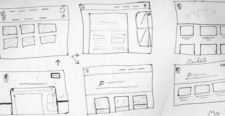
The design
To make the application accessible to a wider install base and save customers time, I decided to design the app so that the templates could be created without writing any code. This meant that users could click around the art-board and tool-panes to quickly insert layers and customise aesthetic details such as typography, colours, and imagery. The app's email design experience feels familiar to users of other design applications, although the form and functionality was guided by user needs. I would spend hours and days adjusting the spacing and how icons would look and fit to a 72dpi screen without emulating any popular technology company's fashionable design language.

Instead of starting completely from scratch, with the very first version of the application I adapted the design work on a CMS app project that I had been occasionally working on.
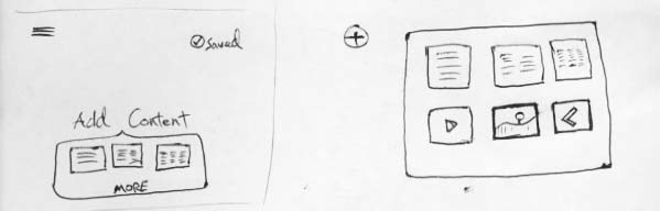
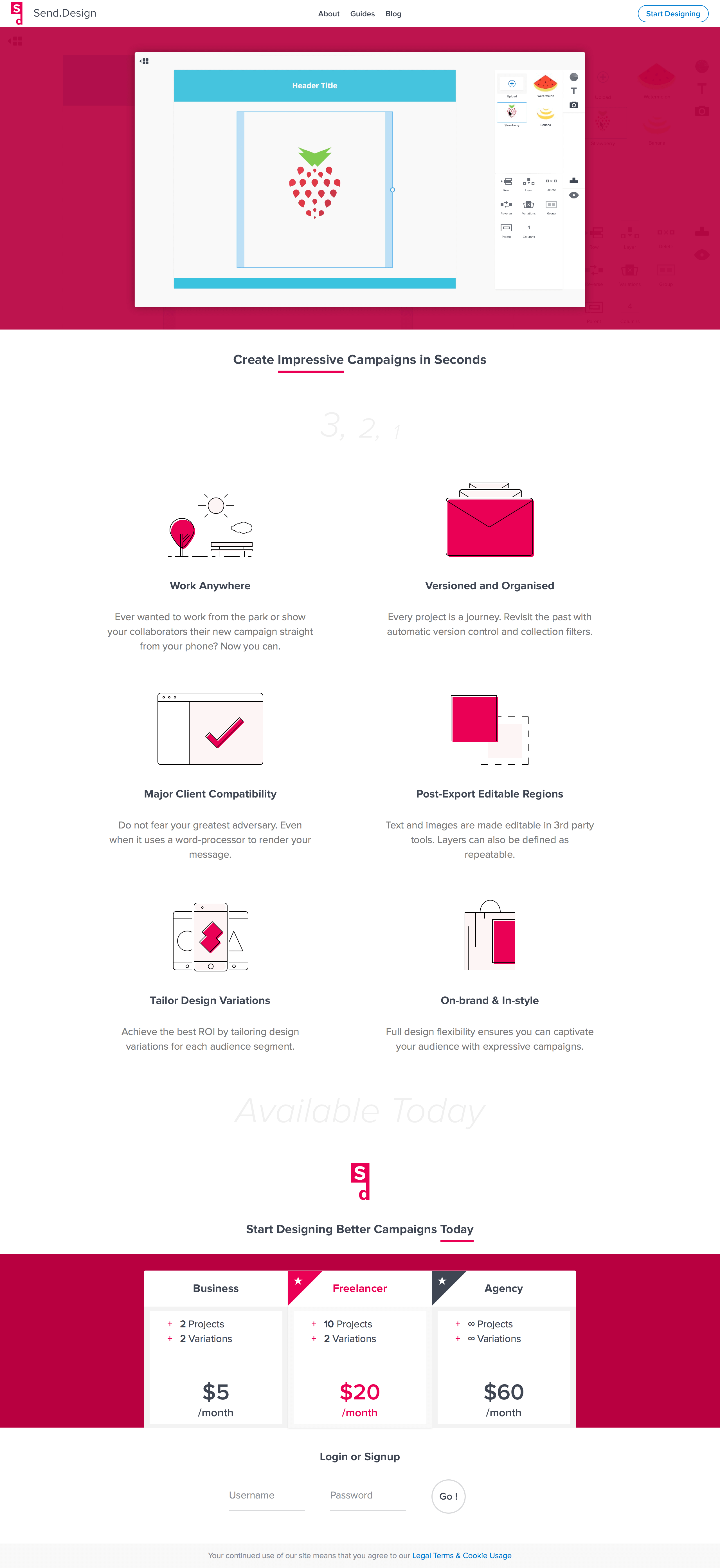
Projects Collection View
For the application interface I decided to make the first screen display the projects area. This is where the projects are listed in reverse-chronological order. I placed the project add button inline with the project thumbnails so as to aid the users understanding that it will create a project. This stage of the user’s journey could be improved by displaying a in-page welcome message and illustration specifically for users who have no projects yet. In addition to listing the projects the first screen also displays a header area which provides a link to the guides section which may be of assistance to users unfamiliar with the application.
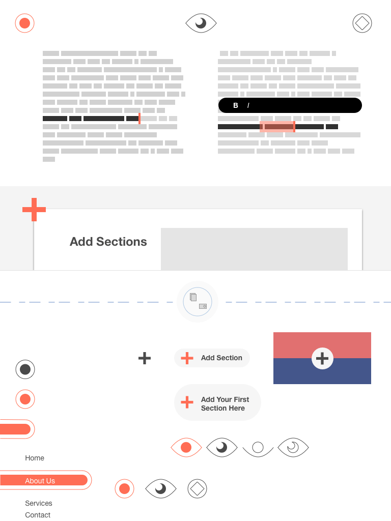
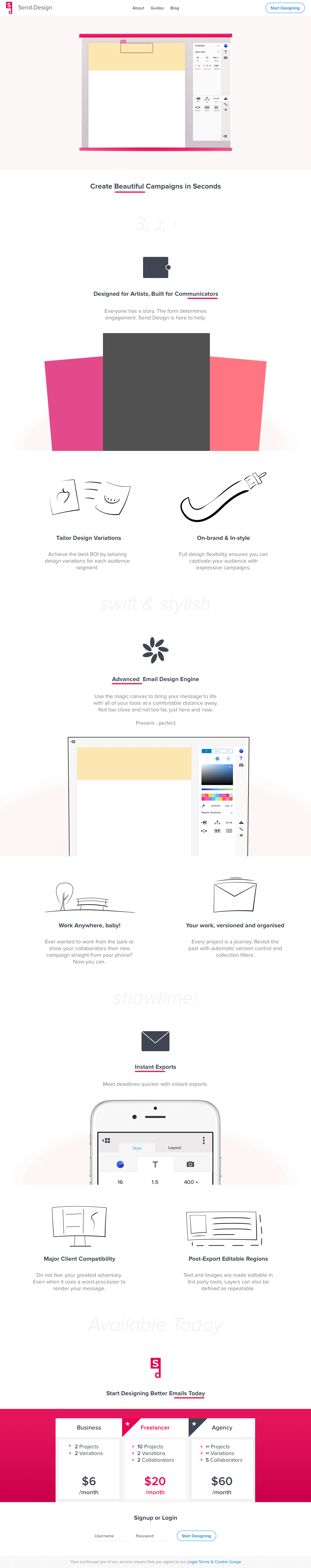
The Editor
Once the user adds a project they are taken to the editor. The editor is arranged so that the canvas appears before the tool-panes, to influence the user base (who read left-to-right) to think about their work before their options. The reasoning is they are using the application to produce work — not play with buttons. After looking at the blank canvas and deciding how best to proceed they can direct their focus over to the tools to find what they need to use.
Workflow Context
Similar to the reasoning around the canvas and tool positions, the tool panes appear before the vertical pane tab icons as they have a closer association with changes to the content than the icons which only change views. The most common tools to be used initially are the layout and colour tools, so I made them the defaults to be displayed, requiring no unnecessary interaction with the toolset icons just to complete the initial scaffolding tasks. Once the user has created most of the base layout they can then think of adding images and working on typography.
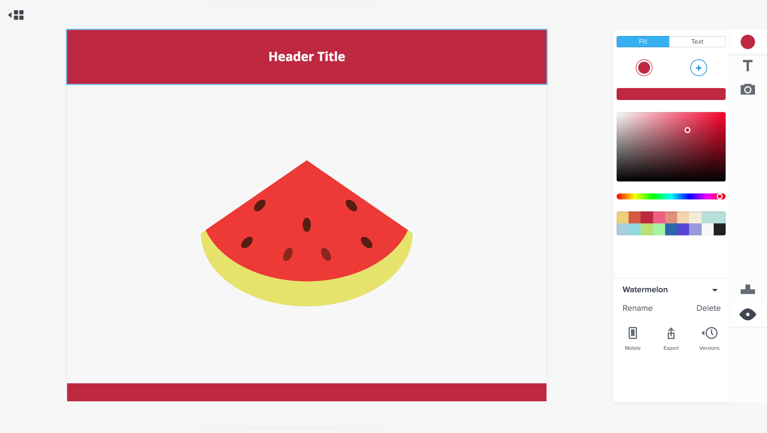
Communicating Context
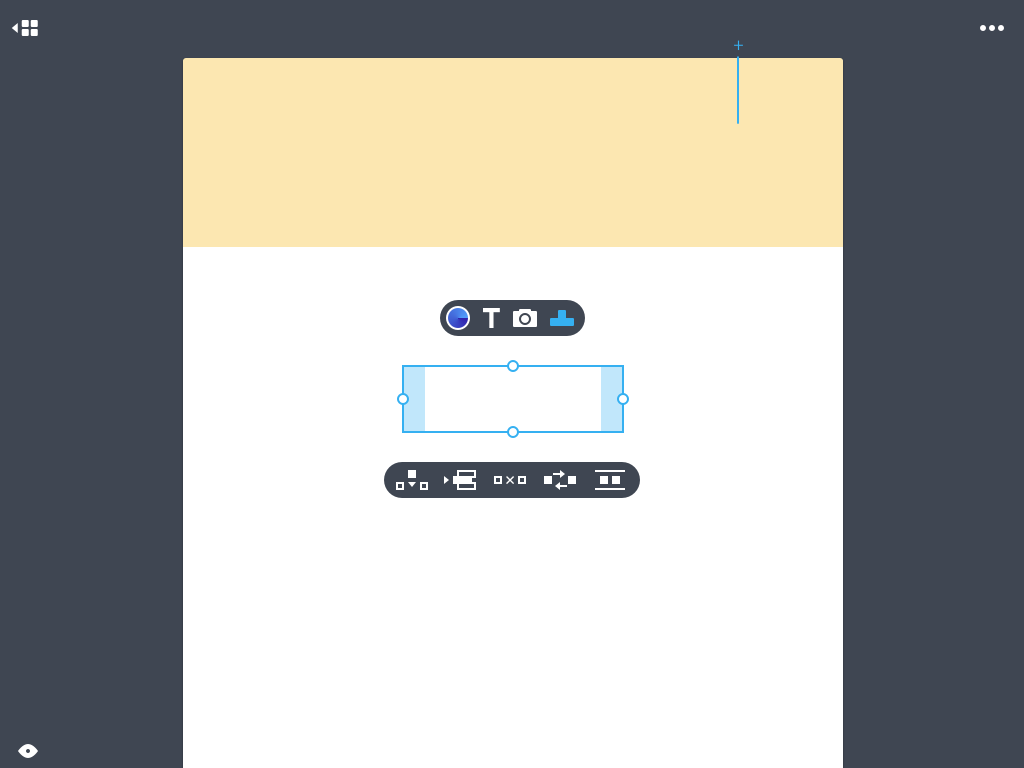
To avoid distracting the user I ensured that only applicable options were available to the user, either by indicating that they are disabled or by hiding them completely. For the colour pane I decided that it would be best to hide the colour editor until a colour had been added to the layer. The layer’s current colours are also indicated by the toolset icon, which turns into a radial gradient when there is more than one colour. As for the layout pane the context is more complicated as it is based on the type of layer content selected in the art-board, and so options not appropriate were disabled rather than hidden so that they could still be seen. By being able to see that options exist, the user is more likely to be able to discover their correct usage contexts. I also explored other forms of contextual interface, such as an add layer button which appears inline to the art-board content when hovering areas that support adding more layers.
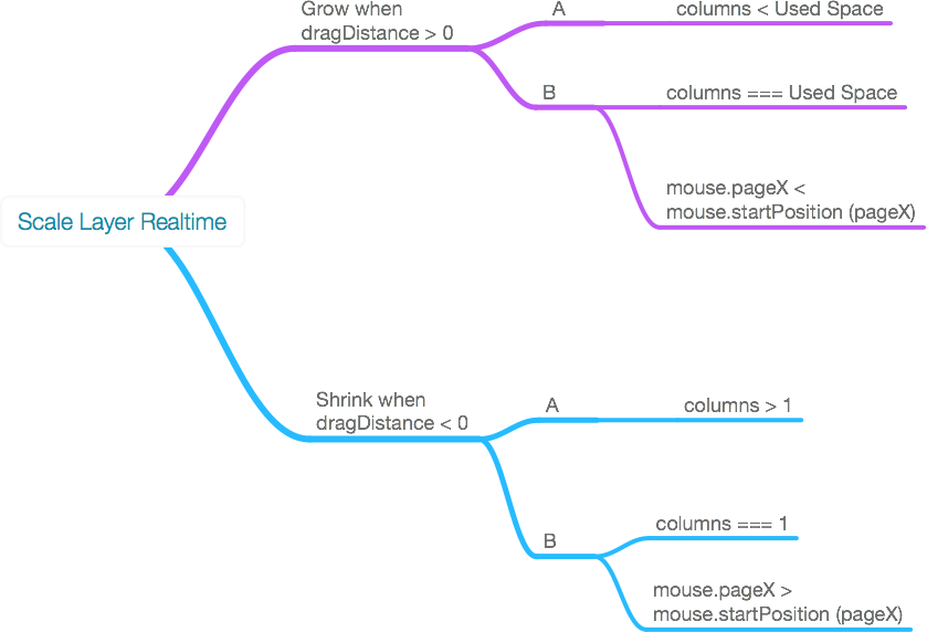
Formulating the Layout Engine
To create the layout engine I had to design an algorithm which would cover numerous layout-editing contexts. When I started the project I did not have much experience with such a task and so with the early version of the layout logic I found numerous cases where the layout logic would fail and the layout would be destroyed, sometimes even unintentionally deleting layers or incorrectly converting a layer to another type. Eventually I noticed a commonality between most of the issues and I redesigned the layout logic to utilise a pattern that covered these issues, and thus solved a multitude of problems at once. In other cases where the bugs were quite unique I had to hard-code case-specific logic into the algorithm which would increase the technical debt of the project substantially, especially in future cases when the base layout logic had to be tweaked.
Programmatic Complexity & Performance
Other challenges were faced when implementing the layout engine such as using an immutable state flow which I implemented to enhance render performance. Overall this extra work was beneficial because it made maintaining the application easier as it grew in complexity, and it also resulted in better performance. In addition to this I had written a series of utility functions for working with the art-board data structure which I initially wrote poorly but was able to rewrite later in a more sophisticated manner, to increase performance even further. Because the utility functions were simple they were easy to refactor and their refinement would benefit the hundreds of instances where they were utilised.
Due to the way that the application was written the performance was not harmed by the addition of features or logic complexity. However despite all of the things which were done right, some very basic things were done massively wrong; like having the state subscription top-level and trickling the state down via props. By not having more granular state subscriptions the verbosity of the code was much greater and unrelated state and view reactions would occur. Fortunately the early version of React that I was using could handle this without issue.
Version Control Feature
The app's version control system was used as a selling point, and it was surprisingly the easiest feature to implement into the application. Originally I wanted to display a thumbnail for each version of a user’s project, but I decided that it would quickly use up too much disk storage so if they were added less versions would have to be recorded. Instead I opted to just display a list of dates and times to represent each version. This is less than ideal, but it ensured that all versions could be stored. Thumbnails cannot communicate much detail anyway. Perhaps in future the optimal solution would be large previews limited to a certain number of recent major versions, leaving the remaining version listings as text. That would be an intelligent compromise.
Database Shenanigans
For server-side data storage I initially used MongoDB, but I eventually switched half-way through the project to PostgreSQL. The first versions used MongoDB so that I could store the data in a similar manner to how it was used on the client. Later this resulted in performance issues and I rewrote the data retrieval queries to increase the performance dramatically. Yet, as the application grew in complexity I knew I would actually face performance and productivity issues working with MongoDB and so I switched to PostgreSQL to take advantage of relational data storage. The relational method made writing efficient queries much easier. Fortunately, switching between the two technologies did not require too much development time; although I will say learning the jargon was tedious.
Layout Variations Feature
Additionally I understood that many brands have multiple customer segments and that they are interested in tailoring their communications with each segment. To address this need I added a variations feature which would allow art-boards to have multiple different styles. As across the different variations some layers may have the same style, I made it so that the layers which are to have different styles can be set on an individual basis to do so. When switching art-board variation all of the layers which have variations change simultaneously.
The Brand
The brand was designed alongside the application, and as the development of the service became more mature so did the branding and aesthetics of the service. The marketing site went through several major variations, as did the brand.


Initially I wanted to imitate a sort of origami feel but I quickly abandoned that idea and explored iconography surrounding envelopes, before arriving at the typographic logo. With the origami look I wanted to emphasise craft, and with the envelopes I wanted to emphasise mail. When I decided to create the typographic logo I wanted to emphasise the brand’s initials. I designed the logo in such a way so that its form is similar to the semaphore flag which appears on some physical mailboxes.
The Site

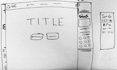
For the site imagery originally I intended to use monochromatic graphics, initially taking an approach which used giant simple icons. The icons were too minimal for their dimensions on the page and so I later explored creating icons which had an organic “sketchbook” look, complete with varying-width organic strokes. While I had decided to use the sketches to create a more casual and comforting tone I eventually realised that it was a terrible mistake as it made the application appear unprofessional and unrefined. So to address the problem with the tone I have settled on imagery which is made of simple geometric shapes and with just-enough detail to be displayed at their size.

For the site layout and design itself beyond static imagery I knew from the start that the best approach would be to display a video in the header which demonstrates some of the application’s features. I decided to use a native HTML video instead of a third-party embed because I wanted to be able to use arbitrary video dimensions and also to be in control of the brand-experience. I made the background area around the video demo display the same video, but faded into the primary site colour. This provided the necessary contrast to easily view the video and seperate the site header, while also maintaining the site’s minimalist appearance.

Colour Usage
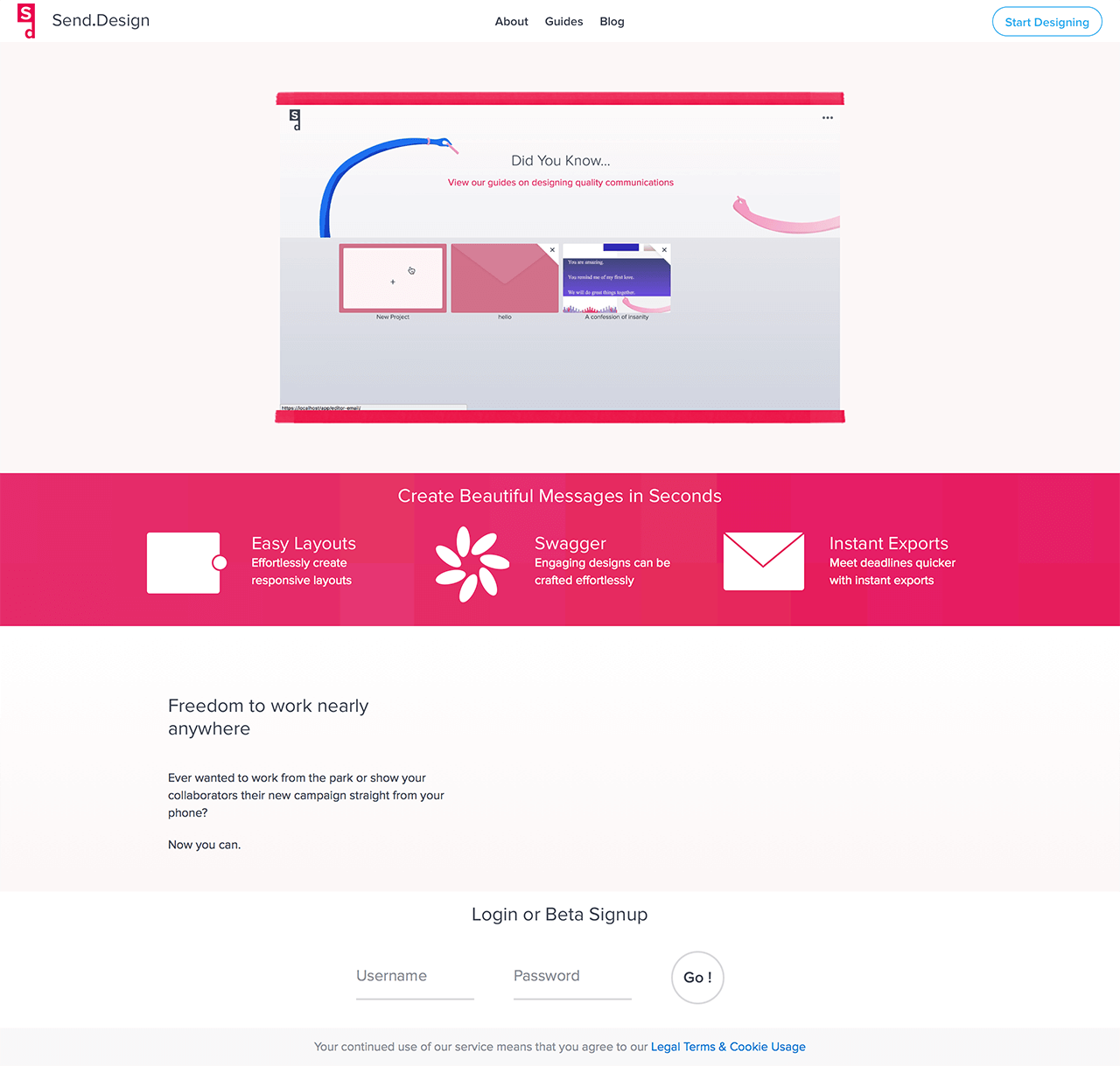
Originally the site made use of a bright pink but after considering the audience I decided that it could alienate users as it would appear too immature. After the bright pink stage I experimented with extreme-minimalism where there was very little differentiation between colours and with almost identical RGB hex codes. This made the landing page too bland and made it hard to differentiate different areas of the layout. Eventually I decided to revisit the original approach with bold-distinctive colours. The new primary site colour was a bright maroon, which provides appropriate contrasts while retaining the youthful feel without doing so to an excessive degree. Splashes of colour were used to guide the viewer’s eye down the page and to make important areas such as the pricing chart more distinguishable.
General Site Layout
Similar to the site's other design concerns, the layout went through three major iterations. Initially too empty, then too lengthy and convoluted, and finally focused on major selling points. The original version only had the video, title, and three icons. The next version involved a features section which had an alternating layout pattern of one and two column which would show a main feature followed by two smaller semi-related features. While there have been studies that show users are happy to continue scrolling I personally found it tedious, so I changed the layout so that it is shorter and more focused. Graphics are used to maintain interest so the layout can succinct. There are contradicting theories and test results regarding above-the-fold content and lengthy pages; which could indicate that the appropriate page length depends on its kind of content. Obviously though if you actually think about it the first thing people see needs to be of relevance, and what follows is tertiary.
User Guides
After analysing other SAAS sites I noticed that it was common to provide user-guides. While I understood that you should design an application in such a way as to not require guides, you should provide them anyway for two reasons:
- Regardless of how superb we think our designs are there are going to be users who don’t understand them.
- The guides feature widens the marketing site surface area, providing more opportunities to demonstrate the application to prospective users. SEO. Originally I intended for the guides to be only for signed-in users, but decided to add it to the main site for the marketing benefits.
Pricing
The pricing strategy of the site was conceived to provide all users with cost-effective options which would deliver what I predicted to be the maximum potential revenue for each user based on their requirements. Four types of users were anticipated; casual, businesses, freelancers, and agencies. Since casual users provide no value for a B2B service I decided not to address their needs and instead focus purely on the other three. I decided that independent businesses would only need a couple of templates and variations to their templates as they only need to design for themselves, and that freelancers would probably not be able to serve more than a few clients a month, and that agencies are comfortable spending more to receive maximum features. My assumptions were educated by my prior studies of online essays from product managers and my marketing education at University. The initial prices can later be adjusted to address future market forces. My thinking afterwards is that the pricing and mix in general should be tailored to who the people using your thing are — not what they think they need.
To make the pricing table legible I utilised the primary colour to improve its contrast from other content so it can be easily identified and read. I arranged the pricing tiers in order by there pricing, and I highlighted the second two tiers in various ways to indicate their superior value to the base “business” tier. Since the middle tier is the most likely to be used, as I understand from psychology research on pricing, I decided to give it the most prominence between the other options so as to reduce friction for prospective users. The brand colour is applied to this option as a means of utilising the affiliation with the brand colour which has been established since the user scrolled from the top of the site.
Overall I am happy with what I have achieved with the project. I have successfully solved the problem that I set out to achieve, and I have managed to further develop and broaden my skill-set along the way. This application can be continually improved to deliver more value to its users going forward. Maintaining the application will provide supplementary learning opportunities to any professional roles that I am fulfilling at any given time.